Showing posts with label Graphic Information Design. Show all posts

Tuesday, 26 February 2008

Typographic Cities

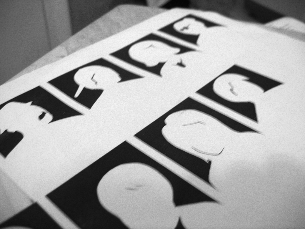
I was asked to produce an invitation poster based on the subject "Typographic Cities". As it was part of our typography module (1st year) I had decided to concoct a city of typography in an interesting and un-poster like style. Not every poster should be obvious, attention-grabbing, to-the-point and simple, I wanted to do the opposite, something delicate, detailed and intriguing, and more engaging to the audience. That may look like one thing at the first glance, but something completely different at the second. And so I leave this image for you wonderful people to work out. It is aimed at engaging people and for people who love crosswords or mind-games of that sort.

As a hint, you can try looking for the title "Typographic Cities" and search the streets for something interesting.


As a further note, I'd like to say that the intended place for this would be a tube or a train, as many of my journeys to and fro university consist of me standing squashed like cattle in a tube packed full of people, and with nothing to do but trying to avoid looking at someone intentionally. Engrossed in this poster would be an interesting way to spend that journey.

Friday, 4 January 2008

Representing the Family

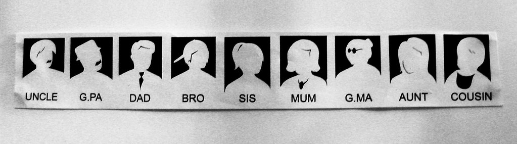
So here's a project from last year, based on representation of information. We joined into a group of 4, and decided to look at how we could represent our level of love for each main member of our family.

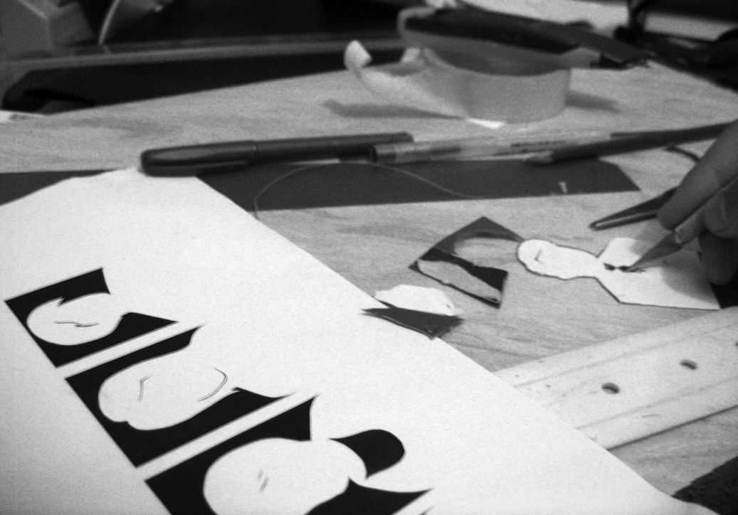
It took many days of sketches to work out how to represent certain people. We had to bear in mind that representing something in one way could mean something else in another person's culture.


This is the final key we created, a total of 10 characters.


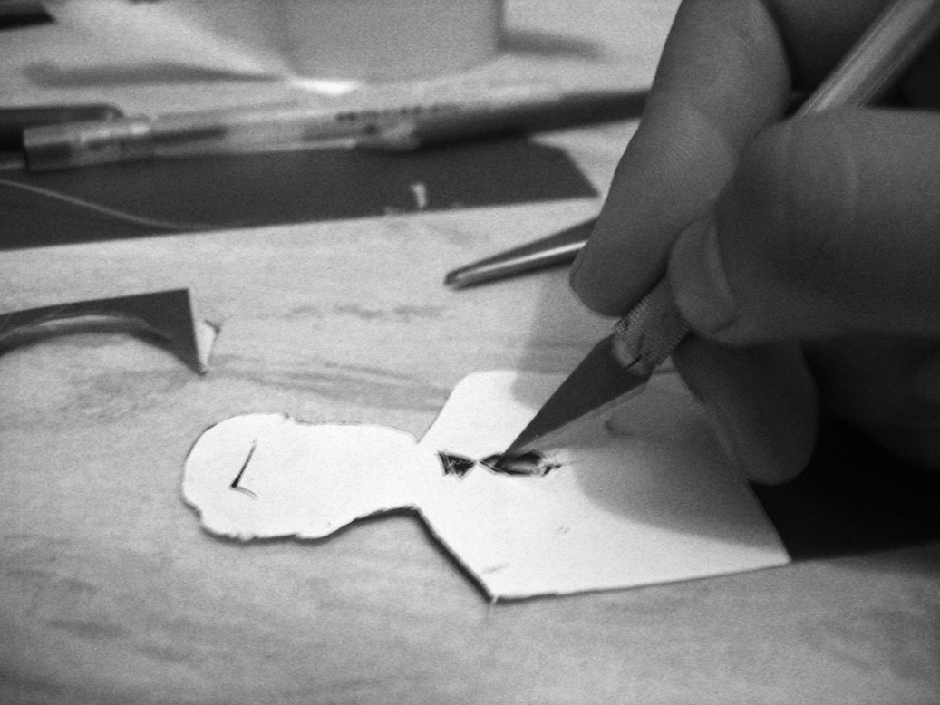
An extra print out to use as a guide to cut out a prototype on thin acrylic.


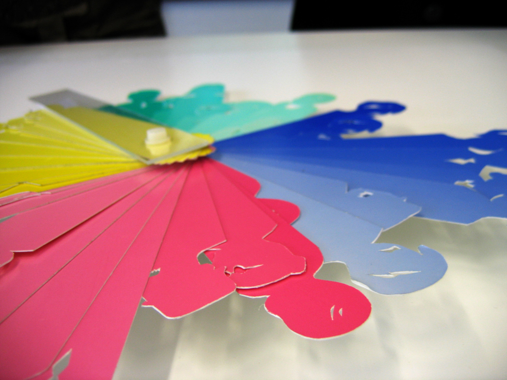
This is the final version. It's created as a fan, and each group member is represented using a different colour. We chose to represent our love and closeness to each member by varying the length, i.e the longer it is the closer we are to them. Each person gets 20 characters, one for the father's side and one for the mother's.


The other people in my group included: Hourieh, Sachiko, and Zara.

Tuesday, 27 November 2007

Da Vinci

I've decided to upload a few of my sketches from 2 years ago. This was done while brainstorming on a cd package that involved making an application.


I chose to base it on Da Vinci's cryptology/cryptography (depending on how you'd like to say it) and make a game that initiated an interest in cryptology as well as educating everyone on the life of the great master.


Well it was the first project I did in my Graphic Information Design course (I joined a semester late), and so I didn't know how to use the software and had no idea how to do the programming in Director, but I loved doing the sketches. Unfortunately the actual results of the application was not a success, I'm just glad I passed (I did pretty well too). It seems that I didn't have to make the actual application, all I needed was a sound idea and a great plan. These 3 are the only remnants of that project, and were drawn with a HB and a 2H pencil (if I remember correctly).